Have you ever struggled with presenting complex data in a way that is easy for your audience to understand? Animation can be a powerful tool to simplify data presentations and make information more engaging and accessible. By adding movement and visual elements to your data, you can create a dynamic and interactive presentation that captivates your viewers and helps them better comprehend the information you are sharing.
Using animation to simplify data presentations involves breaking down complex concepts into bite-sized pieces and using visual cues to guide your audience through the information. By incorporating motion and transitions, you can highlight key points, draw attention to important data, and create a more engaging experience for your viewers. Animation can help bring your data to life and make it easier for your audience to absorb and retain the information you are presenting. So, if you want to make your data presentations more effective and engaging, consider incorporating animation into your next project. Interested to learn more about how animation can simplify data presentations? Keep reading to discover some practical tips and tricks for using animation to enhance your data presentations and captivate your audience. With animation, you can transform your data into a compelling story that resonates with your viewers and leaves a lasting impression. Start using animation today to simplify your data presentations and make your information more accessible and engaging.
Table of contents
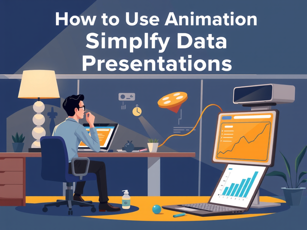
Enhance Data Visualization with Animated Graphics
Enhance Data Visualization with Animated Graphics. Enhancing data presentations with animated graphics can make complex information easier to understand and more engaging for viewers. By incorporating animation into your data visualization, you can simplify the presentation of data and highlight key trends or insights. Animated graphics can help draw attention to important data points, guide the viewer's focus, and make the information more memorable. Additionally, animations can add a dynamic element to your data presentations, making them more visually appealing and interactive for your audience.

Streamline Complex Information with Animation Techniques
Are you struggling to communicate complex data in a simple and engaging way? Animation techniques can be a game-changer when it comes to streamlining information and making it easier for your audience to understand. By incorporating animations into your data presentations, you can effectively simplify the data and make it more visually appealing and easy to digest.
Animations can help you break down complicated information into bite-sized chunks, making it easier for your audience to grasp the key points. By using visual cues and movement, animations can help draw attention to important data points and guide the viewer through the information in a clear and logical manner.
In addition to simplifying data, animations can also add an element of interactivity to your presentations. By incorporating interactive elements such as clickable buttons or animations that respond to user input, you can further engage your audience and encourage them to explore the data in more depth.
Overall, animation techniques can be a powerful tool for simplifying data presentations and making them more engaging and accessible to your audience. By leveraging the power of animation, you can effectively streamline complex information and create presentations that are both informative and visually appealing. So why not give it a try and see how animations can help take your data presentations to the next level?
Incorporate Animated Visuals to Simplify Data Interpretation
Incorporating animated visuals into data presentations is a powerful way to simplify the interpretation of complex information. By adding movement and interactive elements to charts, graphs, and other data points, you can engage your audience and make it easier for them to understand the key takeaways. Animated visuals can help to break down data into more digestible pieces, highlight important trends or patterns, and provide context to the numbers being presented. This not only makes it easier for viewers to interpret the data, but also helps to keep them engaged throughout the presentation.
Frequently Asked Question
Using Animation to Simplify Data Presentations
Animation can be a powerful tool when it comes to simplifying data presentations. By using animations to visually represent data, you can make complex information easier to understand and digest. Animation allows you to break down data into smaller, more manageable chunks, making it easier for your audience to process. This can help to avoid overwhelming your viewers with too much information at once, allowing them to focus on one key point at a time.
Benefits of Using Animation in Data Presentations
There are many benefits to using animation in data presentations. Animation can help to add visual interest to your presentation, keeping your audience engaged and focused. It can also make your data more memorable, as animated visuals are often easier to recall than static charts or graphs. Additionally, animation can help to clarify complex data sets, making it easier for your audience to grasp the key insights you are trying to convey.
Best Practices for Using Animation in Data Presentations
When using animation in data presentations, it's important to keep a few best practices in mind. First, make sure that your animations are purposeful and add value to your presentation. Avoid using animation just for the sake of it, as this can be distracting and take away from the main message you are trying to convey. Animation should enhance your data, not detract from it. Additionally, be mindful of the timing and speed of your animations. Too fast or slow animations can be jarring or confusing, so make sure to find the right balance for your audience.
Conclusion
In conclusion, using animation can greatly simplify data presentations by making information easier to understand and more engaging for viewers. By incorporating movement and visual elements, complex data can be broken down into simpler, more digestible pieces. This can help to enhance the overall impact of the presentation and make it more memorable for the audience. So, when creating data presentations, consider incorporating animation to help simplify and enhance the information being shared. Remember to keep it simple and use easy-to-understand visuals to effectively communicate your message.